Minimalism promised calm. Maximalism promised personality. For years, most people have been stuck choosing between the two, and neither one actually fits how they live. You want breathing room, but you also want your space to feel like yours. You want fewer things on the counter, but not zero things.
A new design framework is getting attention this summer for solving exactly that tension. Thumbtack home design trends expert Kendra Sinclair calls it midimalism, and it describes a middle ground that captures the discipline of minimalism while incorporating the visual richness that maximalism gets right. The term is showing up across design press and social media, and it maps closely to what a lot of people have been doing intuitively without naming it.
What midimalism actually means
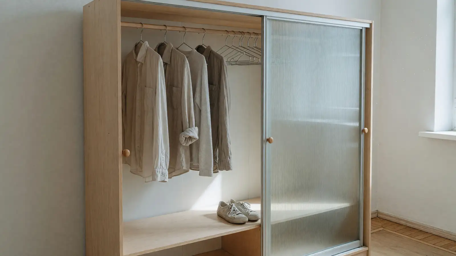
The core idea: you start with the same neutral base that minimalism uses: clean surfaces, edited collections, no filler. Then, instead of stopping there and living in what can feel like a showroom, you layer in a small number of richer accent colors, varied materials, and personal objects that carry real meaning. The result is a space with enough visual interest that your eye has somewhere to land, but not so much that you feel buried.
Sinclair describes it as capturing the uncluttered foundation of a minimalist approach while incorporating strong visual elements that map to maximalism. Rather than forcing a choice between bare surfaces or densely styled shelves, the style acknowledges that most people need something in between.
The philosophy centers on intention rather than quantity. A midimalist room might have five objects on a shelf instead of two or twenty. Each one earns its spot because it matters to the person who lives there, not because it fills space or follows a trend. Filler pieces and trend-driven decor stay out entirely. This creates visual breathing room while preserving the character and warmth that pure minimalism often strips away.
Why the extremes stopped working
Minimalism had a good run, but the version that dominated social media for the past decade created a problem. When “less” becomes an aesthetic goal rather than a practical one, you end up with spaces that look impressive in photographs and feel hollow in person. White walls, matching containers, identical everything. The look is clean, but it can read as sterile, impersonal, or expensive in a way that has nothing to do with actual quality of life.
The honest truth is that most people who tried strict minimalism eventually added things back. They cleared the counter, then put a coffee maker back on it. They emptied the bookshelf, then refilled it with the books they actually read. The editing was valuable. The emptiness was not the point.
Maximalism swung the other direction. Colorful, layered, packed with collected objects. For people who genuinely love surrounding themselves with art, books, and things they’ve found over years, it works. But for many others, maximalism as a style directive creates a different kind of overwhelm — visual noise that makes it harder to relax, harder to clean, and harder to find what you need when you need it. The Instagram version of maximalism also has a consumption problem: the “collected over time” look often requires buying a lot of new things to mimic a patina that authentic collections develop naturally.
Midimalism splits the difference without splitting your attention. The neutral base keeps the space manageable. The curated accents keep it alive. You get the calm without the cold, and the personality without the pile-up.
How to identify a midimalist space
A few characteristics distinguish midimalism from both its neighbors.
The color palette starts neutral but doesn’t stay there. Walls might be white, cream, or soft gray, but the room includes two or three accent tones that show up in textiles, a piece of art, or a single statement furniture item. The accents are deliberate and limited — not a rainbow, not a monochrome, but a restrained selection that gives the room a point of view.
Surfaces are mostly clear. A coffee table might hold a stack of two or three books and a ceramic bowl. A kitchen counter might have a cutting board, a small plant, and a jar of wooden spoons. The difference between this and minimalism is that those objects feel chosen, not placed for a photo. The difference between this and maximalism is that there is still room to set down a cup without moving something first.
Texture does a lot of the work. Linen curtains, a chunky knit throw, a woven basket, a raw wood shelf. These add warmth and visual depth without adding clutter. Minimalism tends to flatten texture in pursuit of visual simplicity. Maximalism tends to bury it under pattern and color. Midimalism lets texture carry the emotional weight.
Personal objects get prime placement. A single framed photograph on a nightstand. A vintage clock on a shelf. A piece of pottery from a trip. These items are the opposite of filler — they are the reason the room feels like someone lives there. The rule seems to be: if it does not mean something to you, it does not go on the shelf.
The editing principle
Sinclair’s framework emphasizes editing over adding, which is what keeps midimalism from drifting back toward maximalism. The process is subtractive even when the result looks fuller than minimalism. You are not looking for more things to put out. You are looking for the few things that deserve to be out, and removing everything that does not make the cut.
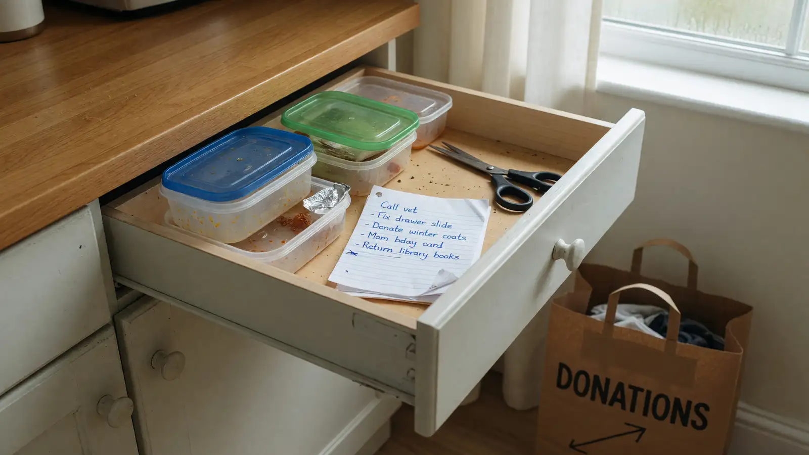
This is harder than it sounds. Most homes accumulate objects slowly — gifts, impulse purchases, things that served a purpose once and now just sit there. Midimalism asks you to be honest about what you actually use, display, or care about, and to let go of the rest. The space that results is not empty. It is edited.
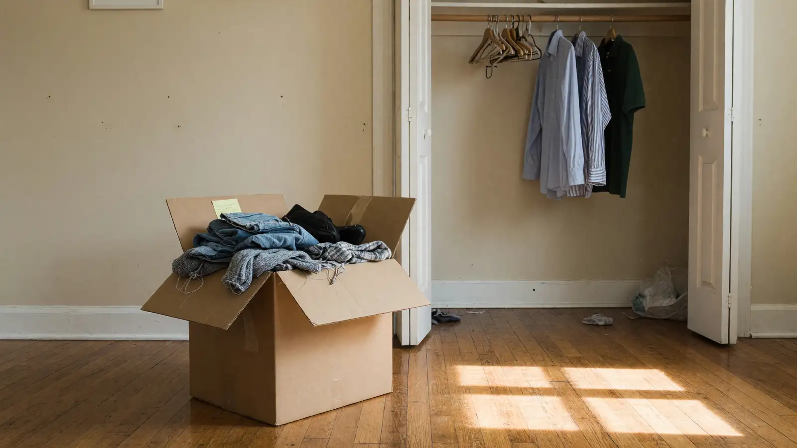
For people who have already decluttered using minimalism methods like KonMari or the 90/90 rule, midimalism is the next step. You have cleared the excess. Now you are deciding what goes back, and on what terms.
Where midimalism shows up
The kitchen is a natural fit. Open shelving with a few well-chosen dishes, a single plant, and a cutting board leaning against the backsplash. No knife block, no fruit bowl, no appliance garage hiding five gadgets. The counter space stays usable. The room still looks warm. A midimalist kitchen does not look like a magazine spread. It looks like someone who cooks actually lives there — and that is the point.
Living rooms benefit from the same approach. A sofa in a neutral fabric, one or two throw pillows in a richer tone, a coffee table with a small curated stack. Bookshelves that hold actual books mixed with a few meaningful objects, not rows of identical decorative vases. The room breathes. There is floor space for kids to play or for you to stretch out without navigating around obstacles.
Bedrooms might be the easiest place to start. Clear nightstand, one lamp, one book, maybe a small dish for keys or rings. A bed with quality linens in a warm tone rather than all-white hotel style. A single piece of art above the bed. Nothing on the floor. The room does its job — rest — without feeling like a display case.
Home offices are another strong candidate. A desk with a monitor, a keyboard, a notebook, and a pen. No desk organizer full of pens you never use. No motivational posters. No decorative objects competing for attention with your actual work. The space supports focus because it is not asking your brain to process visual clutter while you try to think.
Getting started without buying new things
The most honest version of midimalism does not require a shopping trip. It starts with what you already own and asks different questions about it. Instead of “does this match the aesthetic?” the questions are: “do I actually use this?” and “does this mean something to me?” and “does this add something to the room, or does it just take up space?”
Start with one surface. A shelf, a counter, a nightstand. Remove everything. Then put back only the items that pass those three questions. The space that remains is your starting point. You can add one or two things later if the room feels too bare, but most people find that the edited version works better than they expected.
If you want to add warmth through texture rather than objects, look at what you already have. A blanket folded at the end of the bed. A woven basket holding remotes. A wooden tray on the coffee table. These are not new purchases — they are existing items doing more work because they are no longer buried under clutter.
One practical tip that helps: take a photo of the cleared surface before you put anything back. Then add items one at a time, photographing after each addition. The difference between “one more thing” and “too many things” is easier to see in a photo than in person, because your eye adjusts to gradual changes when you are standing in the room. This is especially useful in kitchens and bathrooms, where surfaces tend to accumulate slowly over months and you stop noticing the clutter until someone else visits.
The approach also works well for shared spaces where different people have different tolerances for visual noise. A midimalist living room gives everyone some room for their things without letting any one person’s collection take over. The editing discipline becomes a household agreement: everything on display earns its spot, and anything that does not is stored out of sight.
The long game
Midimalism is not a trend in the way that specific colors or furniture shapes are trends. It is a framework for making decisions about what stays in your space and what does not. The specific items will change as your life changes. What stays constant is the editing discipline: fewer things, chosen with care, given room to breathe.
That is probably why it is resonating right now. After years of being told to either strip everything away or fill every surface with personality, people are landing on the version that actually matches how they live. Not empty, not overflowing. Just enough.