Bookshelves are the most public form of storage in most homes. Unlike the insides of closets and drawers, which guests rarely see, bookshelves are on display. They communicate something about who you are — your interests, your tastes, your personality. A chaotic, overstuffed bookshelf sends a different message than one that feels curated and intentional.
The challenge is that bookshelves serve two competing purposes: they store things, and they display things. The tension between these functions is what makes bookshelf styling difficult. Here is how to satisfy both.
The Empty-First Principle
Before arranging anything, remove every single item from the shelves. This feels like unnecessary work, but it is the only way to break the visual habits you have developed. Objects that have been in the same spot for years become invisible. You stop seeing the stack of old magazines on the bottom shelf and the souvenir mug collecting dust on the top. Emptying the shelves forces you to evaluate each item as if seeing it for the first time.
As you remove items, sort into three piles: keep on shelves, store elsewhere, and donate. Be honest about what genuinely deserves visible real estate. The cracked-spine paperback you will never reread and the decorative object you have always found vaguely ugly do not need to stay.
The Rule of Thirds
Professional stylists and visual merchandisers use the rule of thirds as their foundational principle. Divide each shelf visually into three equal horizontal sections. Each section should contain a distinct arrangement: a stack of books, a single decorative object, a small cluster, or intentional empty space. No section should feel identical to the one beside it.
Within each shelf, vary the orientation of books. Some standing vertically, some stacked horizontally. Horizontal stacks create visual rest points and can serve as pedestals for small decorative objects like a candle, a small plant, or a framed photo. The horizontal stacks also break up the repetitive vertical lines that make a fully upright arrangement feel monotonous.
Weight Distribution
Visual weight matters more than physical weight. Dark-spined books, large art books, and heavy decorative objects carry more visual weight than paperbacks with light covers and small trinkets. Distribute heavier visual elements across the full width and height of the bookshelf rather than clustering them on one side or one shelf.
The bottom shelf can handle more visual weight than the top. Heavier books, larger decorative objects, and storage baskets belong on lower shelves. Lighter, more delicate displays belong at eye level and above. This distribution feels natural to the eye because it mirrors how gravity works in the physical world.
The Role of Negative Space
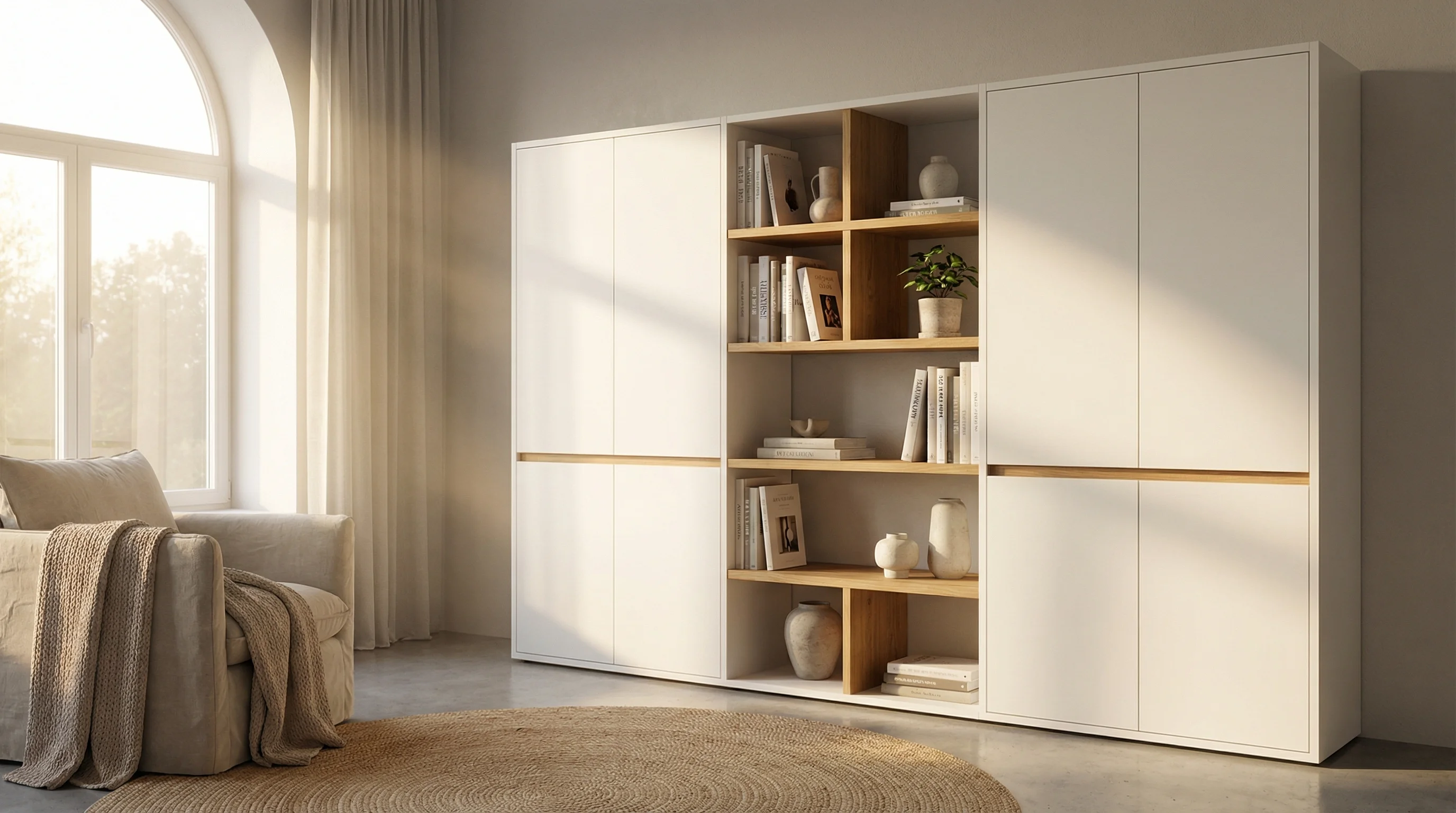
The difference between a bookshelf that looks styled and one that looks stuffed is negative space. Every shelf should have at least one area of breathing room — a gap between objects where nothing lives. This space allows the eye to rest and makes the surrounding objects feel more intentional.
A common beginner mistake is filling every available inch. Resist this. A shelf that is eighty percent full looks curated. A shelf that is one hundred percent full looks like storage. The twenty percent of empty space is what elevates the entire arrangement.
Beyond Books: The Supporting Cast
Books alone, even beautifully arranged, can feel monotonous. The supporting cast of objects is what gives a bookshelf personality. The key is restraint: one or two non-book objects per shelf, not a collection of everything you own.
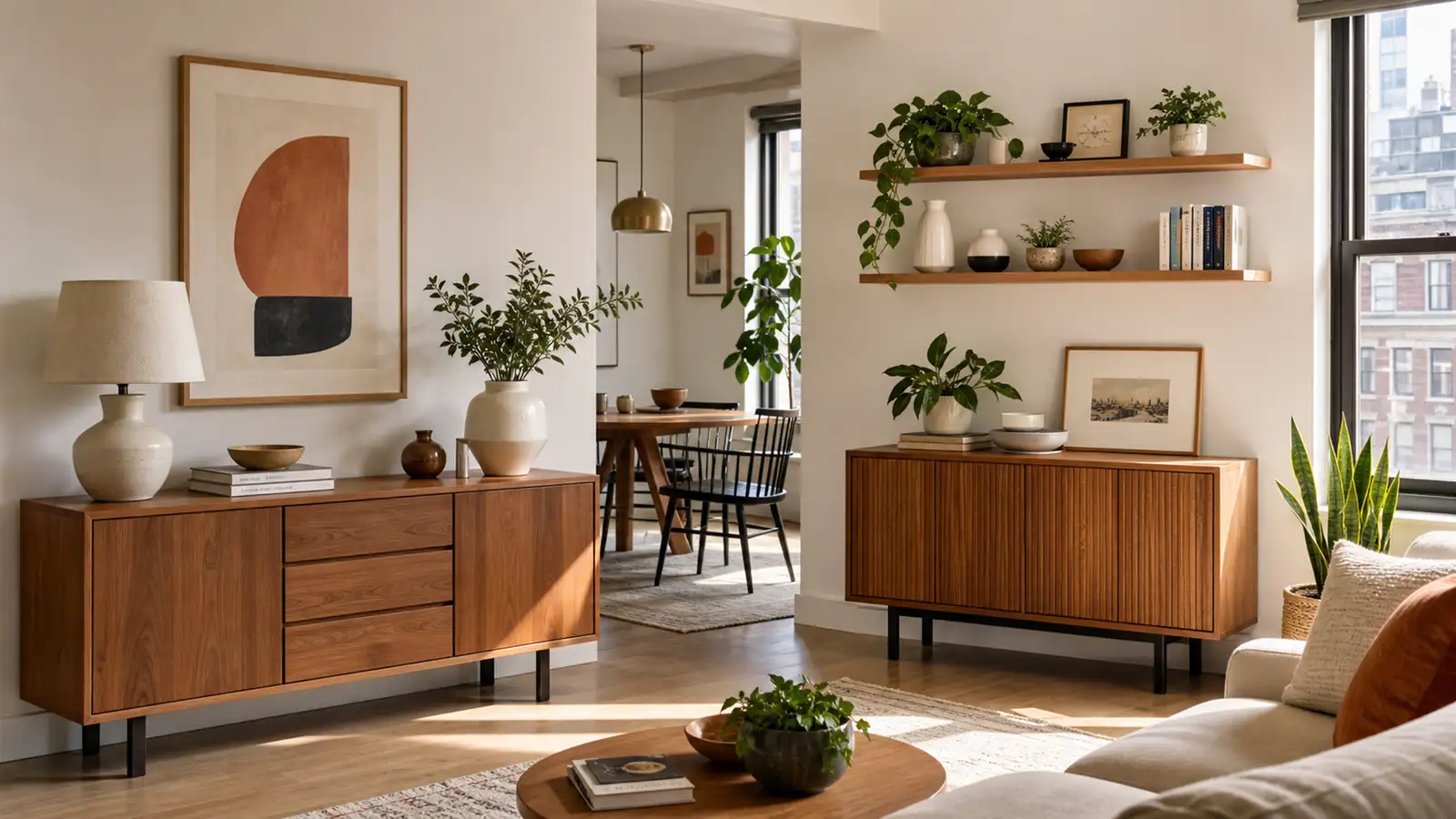
Plants are the most universally effective bookshelf accessory. A trailing plant like pothos on a high shelf softens the hard lines of the bookcase. A compact upright plant like a snake plant adds vertical interest between book groupings. Real plants are ideal, but high-quality faux plants on shelves too dark for living ones are perfectly acceptable.
Art and photos add personal dimension. Small framed prints, postcards in stand-up frames, or a single family photo bring warmth without the clutter of multiple framed photos competing for attention. Lean art against the back of the shelf rather than hanging it on the wall above. The layered look feels more collected and less decorated.
Storage baskets on lower shelves serve double duty. They corral the unattractive necessities — remote controls, charging cables, small electronics — that need to live in the living room but should not be on display. Choose baskets in natural materials like seagrass or canvas that complement rather than compete with the books.
Maintaining the Look
The most beautifully styled bookshelf will not stay that way without a maintenance habit. When you finish a book and return it to the shelf, resist the urge to simply shove it into an open gap. Take sixty seconds to put it back in a way that maintains the arrangement. Better yet, use the return of one book as an opportunity to refresh the entire shelf arrangement — swap the decorative object, adjust the groupings, introduce something new from elsewhere in the house.
A bookshelf is a living arrangement, not a permanent installation. It should evolve slowly over time as your reading habits and tastes change. The goal is not perfection but a shelf that feels authentically yours.